Tell Me :
Talk
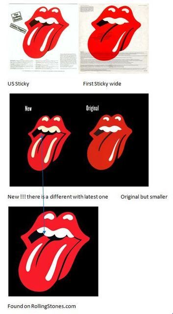
So that explains why the original tongue isn't in the US editions and how the double gleam got done, becoming the 'new' tongue which is the most widely used tongue. How come that's never been talked about before? At least I've never once read anything about it.
I didn't know either and cannot recall it's discussed before........
__________________________

Same here. I have wondered about this topic for years. Many thanks to Title5Take1 for posting this.
The article doesn't say so, but it's probably also the explanation for why the rubber stamp title graphic on the US edition is different from the one everywhere else.
Edited 1 time(s). Last edit at 2015-06-11 07:30 by blivet.
Always preferred the U.S. Version, much more subtle.
J
Click through the pics to see original U.S. rubber stamps >>> [www.nytimes.com]
There have been threads about the tongue but not with this information about it. This is brand new info about why the tongue changed from the original to the 'new' tongue.

Thank you. I didn't realize there were more photos. Cool, now I've got all the answers!
The 'new' one has had several small changes to it over the years... and the original has had one abbreviation.


Talk about your favorite band.
![]()
![]()
![]()
![]()
For information about how to use this forum please check out forum help and policies.
Zipper-cover-background story in today's NEW YORK TIMES
Posted by:
Title5Take1
()
Date: June 8, 2015 04:44
Art of the Rolling Stones: Behind That Zipper and That Tongue
By JOE COSCARELLI, JUNE 7, 2015
As the Rolling Stones prepared recently to rerelease “Sticky Fingers,” their classic 1971 album featuring hits like “Wild Horses” and “Brown Sugar,” the manufacturing process hit a snag: The functional zipper from Andy Warhol’s bulging blue jean album cover, recreated for some new deluxe editions, was taking longer than expected to produce, Universal Music announced, pushing back the release to Tuesday.
They might have asked Craig Braun for help.
As the owner and creative director of the Sound Packaging Corporation, Mr. Braun became known in the ’60s and ’70s as the go-to inventor of elaborate album covers, making his name with projects like the peelable banana on the cover of 1967’s “The Velvet Underground & Nico,” another over-the-top phallic concept by Mr. Warhol.
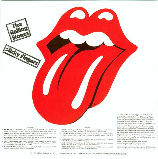
Now, with the Stones’ revisiting “Sticky Fingers” on the aptly named “ZIP Code” tour, which takes them across North America through July 15, Mr. Braun is eager to share the story behind what VH1 called the best album cover ever. “Sticky Fingers” also included the debut of the Stones’ iconic lips and tongue logo, another piece of rock history with a tangled origin story — once again involving Mr. Braun.
“This album heralded an age of really imaginative and provocative packaging,” said the rock critic Richard Harrington, who is working on a book about controversial album art. “It also introduced the greatest band logo of all time.”
After “Let It Bleed” in 1969, the Stones split with their original label, Decca Records, and started their own, Rolling Stones Records. For the label’s first release, the band planned to pair edgy songs like “Can’t You Hear Me Knocking” and “Sister Morphine” with an alluring visual statement. “They were the bad boys of rock ’n’ roll, expressing anger, lust and sex,” said Mr. Braun, now 75 and working as an actor.
While Mr. Braun and his team experimented with other playful concepts — including the oversize Bambu rolling paper cover later used by Cheech & Chong — Mick Jagger was set on Mr. Warhol’s zipper idea. And not only did the zipper have to work — it had to have something behind it.
“They knew if they put jeans and a working zipper that people were going to want to see what was back there,” Mr. Braun said. The reveal also served a practical purpose. “I knew the back of the zippers, which had to be glued down by hand, could damage the record,” he said. “So I decided to fold in a third panel.”
Mr. Braun called Warhol’s Factory looking for extra art. It came in the form of Polaroids from Warhol of a model in his tighty whities — photos that Mr. Braun still has, in their original envelope, at his Manhattan apartment today. (Commonly mistaken for Mr. Jagger, the “Sticky Fingers” underwear model as well as the cover star have remained a mystery; suspects include the Warhol Factory kids Joe Dallesandro, Jay Johnson and Corey Tippin.)
The zipper and underwear in place, Mr. Braun hit still more bumps. Even with a piece of protective cardboard separating each album, the first shipment of records arrived at retailers with some damage. Because of the weight of the stacked albums during transport, the zipper pull from one record was denting the vinyl on top of it, right on the grooves for “Sister Morphine,” the third track on the B-side.
Here, too, Mr. Braun finagled a solution. In the middle of a panicked night, “I got this idea that maybe, if the glue was dry enough, we could have the little old ladies at the end of the assembly line pull the zipper down far enough so that the round part would hit the center disc label,” he said. “It worked, and it was even better to see the zipper pulled halfway down.”
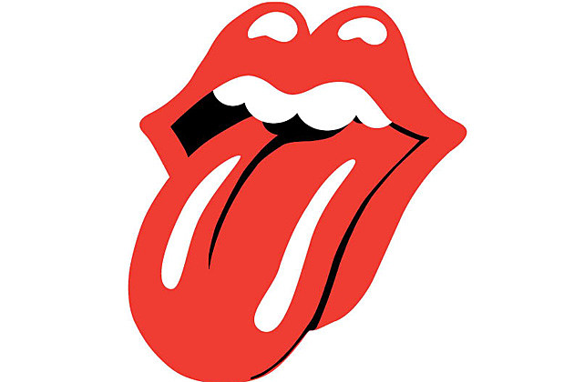
That wasn’t the only makeshift fix that would stick with the Stones. Back in London, John Pasche, a student at the Royal College of Art, worked on a logo for the band and its new label. Mr. Jagger had been inspired by the tongue of the Hindu goddess Kali, Mr. Pasche recalled, “but I didn’t want to do anything Indian, because I thought it would be very dated quickly, as everyone was going through that phase at the time.” Still, Kali’s mouth and lips “triggered something,” he said. (It didn’t hurt that Mr. Jagger had a recognizable mouth himself.)
In New York, Mr. Braun had a deadline and needed the logo. As the tongue design was still unfinished, he settled for a rough one-inch version, faxed over from London by Marshall Chess, the founding president of Rolling Stones Records. “I didn’t tell him what I was going to do with it,” Mr. Braun said.
His in-house illustrators finished the mouth — narrowing the tongue, adding more white accents and a black void for the throat — before blowing it up to cover the entire inside sleeve of the American release (Mr. Pasche’s version was used internationally).
“I thought it was going to get me into trouble,” Mr. Braun said. Instead, his touches on the logo, which still shifts slightly in size and color for different events, often persist to this day, including on the official ads for the “ZIP Code” tour and countless pieces of Stones memorabilia.
Mr. Pasche barely noticed. “It was a relaxed affair,” he said. “I just think things were happening fast and needed to be done, so it was redrawn.”
Mr. Chess, meanwhile, only found out about Mr. Braun’s revisions 45 years later. “He was so nervous about it!” said Mr. Chess, 73.
Both Mr. Braun and Mr. Pasche are pleased with the results of their overlapping contributions to rock mythology. Initially paid just 50 pounds ($76 at current rates) for the design, Mr. Pasche sold his copyright to the band for £26,000 (about $40,000 at the time) in 1984. In 2008, the Victoria and Albert Museum in London bought his original artwork for £50,000 ($92,500).
Mr. Braun estimates that he made six figures creating the “Sticky Fingers” packaging. For a few years in the ’70s, he also licensed and designed an alternate version of the Stones logo for a memorabilia line called Licks, which included jewelry, belt buckles and pins, paying the band only a small royalty.
Licks was a modest success, but probably ahead of its time. “The merchandising for the Rolling Stones is in the billions now,” Mr. Braun said. “I should have stayed in the business.”
[www.nytimes.com]
Edited 1 time(s). Last edit at 2015-06-08 04:47 by Title5Take1.
By JOE COSCARELLI, JUNE 7, 2015
As the Rolling Stones prepared recently to rerelease “Sticky Fingers,” their classic 1971 album featuring hits like “Wild Horses” and “Brown Sugar,” the manufacturing process hit a snag: The functional zipper from Andy Warhol’s bulging blue jean album cover, recreated for some new deluxe editions, was taking longer than expected to produce, Universal Music announced, pushing back the release to Tuesday.
They might have asked Craig Braun for help.
As the owner and creative director of the Sound Packaging Corporation, Mr. Braun became known in the ’60s and ’70s as the go-to inventor of elaborate album covers, making his name with projects like the peelable banana on the cover of 1967’s “The Velvet Underground & Nico,” another over-the-top phallic concept by Mr. Warhol.
Now, with the Stones’ revisiting “Sticky Fingers” on the aptly named “ZIP Code” tour, which takes them across North America through July 15, Mr. Braun is eager to share the story behind what VH1 called the best album cover ever. “Sticky Fingers” also included the debut of the Stones’ iconic lips and tongue logo, another piece of rock history with a tangled origin story — once again involving Mr. Braun.
“This album heralded an age of really imaginative and provocative packaging,” said the rock critic Richard Harrington, who is working on a book about controversial album art. “It also introduced the greatest band logo of all time.”
After “Let It Bleed” in 1969, the Stones split with their original label, Decca Records, and started their own, Rolling Stones Records. For the label’s first release, the band planned to pair edgy songs like “Can’t You Hear Me Knocking” and “Sister Morphine” with an alluring visual statement. “They were the bad boys of rock ’n’ roll, expressing anger, lust and sex,” said Mr. Braun, now 75 and working as an actor.
While Mr. Braun and his team experimented with other playful concepts — including the oversize Bambu rolling paper cover later used by Cheech & Chong — Mick Jagger was set on Mr. Warhol’s zipper idea. And not only did the zipper have to work — it had to have something behind it.
“They knew if they put jeans and a working zipper that people were going to want to see what was back there,” Mr. Braun said. The reveal also served a practical purpose. “I knew the back of the zippers, which had to be glued down by hand, could damage the record,” he said. “So I decided to fold in a third panel.”
Mr. Braun called Warhol’s Factory looking for extra art. It came in the form of Polaroids from Warhol of a model in his tighty whities — photos that Mr. Braun still has, in their original envelope, at his Manhattan apartment today. (Commonly mistaken for Mr. Jagger, the “Sticky Fingers” underwear model as well as the cover star have remained a mystery; suspects include the Warhol Factory kids Joe Dallesandro, Jay Johnson and Corey Tippin.)
The zipper and underwear in place, Mr. Braun hit still more bumps. Even with a piece of protective cardboard separating each album, the first shipment of records arrived at retailers with some damage. Because of the weight of the stacked albums during transport, the zipper pull from one record was denting the vinyl on top of it, right on the grooves for “Sister Morphine,” the third track on the B-side.
Here, too, Mr. Braun finagled a solution. In the middle of a panicked night, “I got this idea that maybe, if the glue was dry enough, we could have the little old ladies at the end of the assembly line pull the zipper down far enough so that the round part would hit the center disc label,” he said. “It worked, and it was even better to see the zipper pulled halfway down.”
That wasn’t the only makeshift fix that would stick with the Stones. Back in London, John Pasche, a student at the Royal College of Art, worked on a logo for the band and its new label. Mr. Jagger had been inspired by the tongue of the Hindu goddess Kali, Mr. Pasche recalled, “but I didn’t want to do anything Indian, because I thought it would be very dated quickly, as everyone was going through that phase at the time.” Still, Kali’s mouth and lips “triggered something,” he said. (It didn’t hurt that Mr. Jagger had a recognizable mouth himself.)
In New York, Mr. Braun had a deadline and needed the logo. As the tongue design was still unfinished, he settled for a rough one-inch version, faxed over from London by Marshall Chess, the founding president of Rolling Stones Records. “I didn’t tell him what I was going to do with it,” Mr. Braun said.
His in-house illustrators finished the mouth — narrowing the tongue, adding more white accents and a black void for the throat — before blowing it up to cover the entire inside sleeve of the American release (Mr. Pasche’s version was used internationally).
“I thought it was going to get me into trouble,” Mr. Braun said. Instead, his touches on the logo, which still shifts slightly in size and color for different events, often persist to this day, including on the official ads for the “ZIP Code” tour and countless pieces of Stones memorabilia.
Mr. Pasche barely noticed. “It was a relaxed affair,” he said. “I just think things were happening fast and needed to be done, so it was redrawn.”
Mr. Chess, meanwhile, only found out about Mr. Braun’s revisions 45 years later. “He was so nervous about it!” said Mr. Chess, 73.
Both Mr. Braun and Mr. Pasche are pleased with the results of their overlapping contributions to rock mythology. Initially paid just 50 pounds ($76 at current rates) for the design, Mr. Pasche sold his copyright to the band for £26,000 (about $40,000 at the time) in 1984. In 2008, the Victoria and Albert Museum in London bought his original artwork for £50,000 ($92,500).
Mr. Braun estimates that he made six figures creating the “Sticky Fingers” packaging. For a few years in the ’70s, he also licensed and designed an alternate version of the Stones logo for a memorabilia line called Licks, which included jewelry, belt buckles and pins, paying the band only a small royalty.
Licks was a modest success, but probably ahead of its time. “The merchandising for the Rolling Stones is in the billions now,” Mr. Braun said. “I should have stayed in the business.”
[www.nytimes.com]
Edited 1 time(s). Last edit at 2015-06-08 04:47 by Title5Take1.
Re: Zipper-cover-background story in today's NEW YORK TIMES
Posted by:
GasLightStreet
()
Date: June 8, 2015 06:19
In New York, Mr. Braun had a deadline and needed the logo. As the tongue design was still unfinished, he settled for a rough one-inch version, faxed over from London by Marshall Chess, the founding president of Rolling Stones Records. “I didn’t tell him what I was going to do with it,” Mr. Braun said.
His in-house illustrators finished the mouth — narrowing the tongue, adding more white accents and a black void for the throat — before blowing it up to cover the entire inside sleeve of the American release (Mr. Pasche’s version was used internationally).
So that explains why the original tongue isn't in the US editions and how the double gleam got done, becoming the 'new' tongue which is the most widely used tongue. How come that's never been talked about before? At least I've never once read anything about it.
Re: Zipper-cover-background story in today's NEW YORK TIMES
Posted by:
Title5Take1
()
Date: June 9, 2015 23:16
I bought my 2-CD copy today at a Barnes & Noble on a lunch break and grabbed it from a big cardboard display rack crowned by the album cover design...and I grabbed the second-to-last copy. I thinks it's selling well.
Re: Zipper-cover-background story in today's NEW YORK TIMES
Posted by:
5stringTele
()
Date: June 10, 2015 08:16
There is a thread here somewhere (I think it was a couple of years ago).Quote
GasLightStreet
... How come that's never been talked about before? At least I've never once read anything about it.
Re: Zipper-cover-background story in today's NEW YORK TIMES
Posted by:
NICOS
()
Date: June 10, 2015 23:49
Quote
5stringTeleThere is a threadQuote
GasLightStreet
... How come that's never been talked about before? At least I've never once read anything about it.
here somewhere (I think it was a couple of years ago).
So that explains why the original tongue isn't in the US editions and how the double gleam got done, becoming the 'new' tongue which is the most widely used tongue. How come that's never been talked about before? At least I've never once read anything about it.
I didn't know either and cannot recall it's discussed before........
__________________________
Re: Zipper-cover-background story in today's NEW YORK TIMES
Posted by:
blivet
()
Date: June 11, 2015 07:28
Quote
NICOSQuote
5stringTeleThere is a threadQuote
GasLightStreet
... How come that's never been talked about before? At least I've never once read anything about it.
here somewhere (I think it was a couple of years ago).
So that explains why the original tongue isn't in the US editions and how the double gleam got done, becoming the 'new' tongue which is the most widely used tongue. How come that's never been talked about before? At least I've never once read anything about it.
I didn't know either and cannot recall it's discussed before........
Same here. I have wondered about this topic for years. Many thanks to Title5Take1 for posting this.
The article doesn't say so, but it's probably also the explanation for why the rubber stamp title graphic on the US edition is different from the one everywhere else.
Edited 1 time(s). Last edit at 2015-06-11 07:30 by blivet.
Re: Zipper-cover-background story in today's NEW YORK TIMES
Posted by:
JMARKO
()
Date: June 11, 2015 07:38
Quote
blivet
The article doesn't say so, but it's probably also the explanation for why the rubber stamp title graphic on the US edition is different from the one everywhere else.
Always preferred the U.S. Version, much more subtle.
J
Re: Zipper-cover-background story in today's NEW YORK TIMES
Posted by:
Title5Take1
()
Date: June 11, 2015 10:00
Quote
blivet
it's probably also the explanation for why the rubber stamp title graphic on the US edition is different from the one everywhere else.
Click through the pics to see original U.S. rubber stamps >>> [www.nytimes.com]
Re: Zipper-cover-background story in today's NEW YORK TIMES
Posted by:
GasLightStreet
()
Date: June 11, 2015 18:38
Quote
NICOSQuote
5stringTeleThere is a threadQuote
GasLightStreet
... How come that's never been talked about before? At least I've never once read anything about it.
here somewhere (I think it was a couple of years ago).
So that explains why the original tongue isn't in the US editions and how the double gleam got done, becoming the 'new' tongue which is the most widely used tongue. How come that's never been talked about before? At least I've never once read anything about it.
I didn't know either and cannot recall it's discussed before........
There have been threads about the tongue but not with this information about it. This is brand new info about why the tongue changed from the original to the 'new' tongue.
Re: Zipper-cover-background story in today's NEW YORK TIMES
Posted by:
GasLightStreet
()
Date: June 11, 2015 18:47
The UK edition is better than the US edition.
UK

US
UK
US
Re: Zipper-cover-background story in today's NEW YORK TIMES
Posted by:
blivet
()
Date: June 11, 2015 21:20
Quote
Title5Take1Quote
blivet
it's probably also the explanation for why the rubber stamp title graphic on the US edition is different from the one everywhere else.
Click through the pics to see original U.S. rubber stamps >>> [www.nytimes.com]
Thank you. I didn't realize there were more photos. Cool, now I've got all the answers!
Re: Zipper-cover-background story in today's NEW YORK TIMES
Posted by:
NICOS
()
Date: June 12, 2015 00:12
This is the first time I see three version.....................
__________________________

__________________________
Re: Zipper-cover-background story in today's NEW YORK TIMES
Posted by:
GasLightStreet
()
Date: June 12, 2015 06:18
Quote
NICOS
This is the first time I see three version.....................
The 'new' one has had several small changes to it over the years... and the original has had one abbreviation.
Re: Zipper-cover-background story in today's NEW YORK TIMES
Posted by:
GasLightStreet
()
Date: June 12, 2015 06:19
Sorry, only registered users may post in this forum.
Online Users
abbiatti , bauk77 , cyclist , deardoctor , HardRiffin , kitoise , Martin90 , onestep , Shotaway2 , steffialicia , voodoodrew , Woz , Zotz
Guests:
2110
Record Number of Users:
206
on June 1, 2022 23:50
Record Number of Guests:
9627
on January 2, 2024 23:10