Tell Me :
Talk
They also realized 'sex sells'...I give you the Kama Sutra as exhibit 1.
I thought that was a 'how to' book...man I hurt myself with that rotten book, a tennis racket and a #2 pencil...chapter 18 I think it was
And John Pasche's original artwork was still grey.
Victoria & Albert Museum, London (UK)
Edited 2 time(s). Last edit at 2015-07-17 17:20 by Irix.

"As we say in England, it can get a bit trainspottery"
There are more differences than just the double gleam. It's completely redrawn. You're saying Pasche did both?
Yes. It's never been credited to anyone else.
I would say the first one is more refined, actually. The second more common version looks cruder (probably on purpose).
As to your question, "Why would that not be John Pasche's?" I'm only asking. To my eye the double gleam version looks different enough from the original that it could have been done by someone else based on the original design.
I was hoping someone here actually had information about the design process, not just guesses.
It's only been attributed to Pasche so there's no reason to believe anything else, the cruder tongue, as you put it. Which is a good description.
Often when designers produce a logo they will create variations for use at different sizes, or when printing in color or black and white/monochrome.
I was wondering if that was the case with the Stones' logo, but there doesn't seem to be any rhyme or reason as to when a given version is used beyond the apparent preference on someone's part for the one we see most often.
It's characteristic of the band that there is confusion and haphazard practice surrounding even its most corporate aspects.
Edited 1 time(s). Last edit at 2013-07-10 00:23 by blivet.
One thing he said struck a chord with me. He mentioned that the company he did the design for had the rights to use it for about 18 months (something like that -- I'm to lazy to review the video), and they produced a lot of t-shirts, patches and stickers. I remember those products from when I was a kid, with the "ugly" variant of the Stones' logo with each tooth outlined and no reflections on the upper lip. I always sort of assumed it was some kind of knock-off that was just different enough to avoid any legal issues, but if Cefalu is telling the truth, it was actually the original version of the logo before Pasche improved it.
Edited 1 time(s). Last edit at 2013-07-11 22:48 by blivet.
Talk about your favorite band.
![]()
![]()
![]()
![]()
For information about how to use this forum please check out forum help and policies.
First designer of Stones Tongue & Lips logo???
Posted by:
georgie48
()
Date: July 8, 2013 14:25
I don't know if this subject has been discussed before, but I recently read an interview (July 17, 2009) from a magazine named Uncovered.
A guy named Ernie Cefalu sort of stated that he may have been (or was) the first one who designed the Rolling Stones Tongue & Lips logo, where officially John Pasche is named (and registered) as the original designer.
What confuses me is that Pasche is said to have designed the logo in 1970 (motivated and inspired by Mick Jagger), while Cefalu mentions his work (on logo and related merchandise) to be finished well before the end of February 1971.
Did Marshall Chess play a role in this??? He said, that he felt like a sixth Rolling Stone, hanging around with the band so intensely.
Who knows more?
Re: First designer of Stones Tongue & Lips logo???
Posted by:
Vocalion
()
Date: July 8, 2013 15:04
Kali
Re: First designer of Stones Tongue & Lips logo???
Posted by:
Munichhilton
()
Date: July 8, 2013 16:46
Hinduism started it...merchandising...
Re: First designer of Stones Tongue & Lips logo???
Posted by:
treaclefingers
()
Date: July 8, 2013 16:48
Quote
Munichhilton
Hinduism started it...merchandising...
They also realized 'sex sells'...I give you the Kama Sutra as exhibit 1.
Re: First designer of Stones Tongue & Lips logo???
Posted by:
Munichhilton
()
Date: July 8, 2013 16:51
Quote
treaclefingersQuote
Munichhilton
Hinduism started it...merchandising...
They also realized 'sex sells'...I give you the Kama Sutra as exhibit 1.
I thought that was a 'how to' book...man I hurt myself with that rotten book, a tennis racket and a #2 pencil...chapter 18 I think it was
Re: First designer of Stones Tongue & Lips logo???
Posted by:
GasLightStreet
()
Date: July 8, 2013 17:23
Jagger got ahold of Pasche. "John created his first poster artwork for the Rolling Stones in 1970 during his final year at the Royal College of Art. He was then commissioned directly by Mick Jagger to produce a logo for the band."
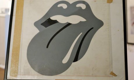
The tongue that is the most used version is not the original.
This is the original tongue, which was used on the record sleeve of Sticky Fingers' initial pressings (and later, slightly different versions of it for Emotional Rescue and Undercover). For whatever reason it changed sometime after the original release of Sticky Fingers to what we know now. And Kali did have something to do with it.

[belgraviagallery.com]

The tongue that is the most used version is not the original.
This is the original tongue, which was used on the record sleeve of Sticky Fingers' initial pressings (and later, slightly different versions of it for Emotional Rescue and Undercover). For whatever reason it changed sometime after the original release of Sticky Fingers to what we know now. And Kali did have something to do with it.
[belgraviagallery.com]
Re: First designer of Stones Tongue & Lips logo???
Posted by:
Irix
()
Date: July 8, 2013 18:10
Quote
GasLightStreet
The tongue that is the most used version is not the original.
And John Pasche's original artwork was still grey.
Victoria & Albert Museum, London (UK)
Edited 2 time(s). Last edit at 2015-07-17 17:20 by Irix.
Re: First designer of Stones Tongue & Lips logo???
Posted by:
Turning To Gold
()
Date: July 8, 2013 18:15
LOL, I had forgotten all about "...and everyone else who had the patience to sit through this for two million hours."
Re: First designer of Stones Tongue & Lips logo???
Posted by:
GasLightStreet
()
Date: July 8, 2013 18:19
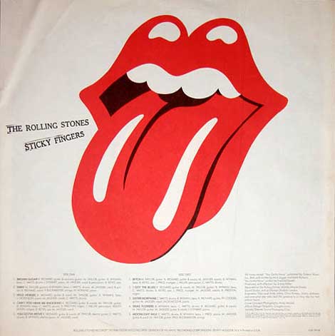
The original red... a bit brighter than the red with the two tongue gleams... funny how even the tone or hue changed.
Re: First designer of Stones Tongue & Lips logo???
Posted by:
Deltics
()
Date: July 8, 2013 18:51
"As we say in England, it can get a bit trainspottery"
Re: First designer of Stones Tongue & Lips logo???
Posted by:
Irix
()
Date: July 8, 2013 19:10
The 1st UK-pressing as well as other international 1st pressings have the tongue by John Pasche on the inner vinyl sleeve, while the 1st north-american pressing has the tongue with the two gleams on the inner vinyl sleeve - [www.discogs.com] .
First north-american pressing 1971.
Edited 6 time(s). Last edit at 2015-07-17 19:20 by Irix.
First north-american pressing 1971.
Edited 6 time(s). Last edit at 2015-07-17 19:20 by Irix.
Re: First designer of Stones Tongue & Lips logo???
Posted by:
GasLightStreet
()
Date: July 8, 2013 21:35
It's in my post above, the huge one.
Re: First designer of Stones Tongue & Lips logo???
Posted by:
blivet
()
Date: July 8, 2013 21:46
I prefer the original. I wonder why they changed it, and who did the redesign. Does anyone know?
Edited 2 time(s). Last edit at 2013-07-08 21:53 by blivet.
Edited 2 time(s). Last edit at 2013-07-08 21:53 by blivet.
Re: First designer of Stones Tongue & Lips logo???
Posted by:
GasLightStreet
()
Date: July 8, 2013 21:48
In all regard to the double gleam change? John Pasche.
Re: First designer of Stones Tongue & Lips logo???
Posted by:
blivet
()
Date: July 8, 2013 21:54
Quote
GasLightStreet
In all regard to the double gleam change? John Pasche.
There are more differences than just the double gleam. It's completely redrawn. You're saying Pasche did both?
Re: First designer of Stones Tongue & Lips logo???
Posted by:
GasLightStreet
()
Date: July 8, 2013 22:02
Quote
blivetQuote
GasLightStreet
In all regard to the double gleam change? John Pasche.
There are more differences than just the double gleam. It's completely redrawn. You're saying Pasche did both?
Yes. It's never been credited to anyone else.
Re: First designer of Stones Tongue & Lips logo???
Posted by:
GasLightStreet
()
Date: July 8, 2013 22:14
There is the orignal, which is rounder, brighter red and the one gleam, and then the second one, the refined, more slimlined, darker red with a double gleam that has been used the most.
Why would that not be John Pasche's? The guy in the video's version looks nothing like Pasche's version; it looks like a kid did it.
Perhaps Pasche went for symetry and used a double gleam. Maybe Jagger thought it was too bright red so he made it darker. Maybe Jagger thought it was too round and wanted to be able to make it fit better regardless of the size...
Re: First designer of Stones Tongue & Lips logo???
Posted by:
Rokyfan
()
Date: July 8, 2013 23:20
Of course, regardless of this guy Pashce, you are correct. That's who he copped it from.Quote
Vocalion
Kali
Re: First designer of Stones Tongue & Lips logo???
Posted by:
Deltics
()
Date: July 8, 2013 23:56
Sticky Fingers insert without the text.

"As we say in England, it can get a bit trainspottery"

"As we say in England, it can get a bit trainspottery"
Re: First designer of Stones Tongue & Lips logo???
Posted by:
blivet
()
Date: July 9, 2013 04:57
Quote
GasLightStreet
There is the orignal, which is rounder, brighter red and the one gleam, and then the second one, the refined, more slimlined, darker red with a double gleam that has been used the most.
Why would that not be John Pasche's? The guy in the video's version looks nothing like Pasche's version; it looks like a kid did it.
Perhaps Pasche went for symetry and used a double gleam. Maybe Jagger thought it was too bright red so he made it darker. Maybe Jagger thought it was too round and wanted to be able to make it fit better regardless of the size...
I would say the first one is more refined, actually. The second more common version looks cruder (probably on purpose).
As to your question, "Why would that not be John Pasche's?" I'm only asking. To my eye the double gleam version looks different enough from the original that it could have been done by someone else based on the original design.
I was hoping someone here actually had information about the design process, not just guesses.
Re: First designer of Stones Tongue & Lips logo???
Posted by:
GasLightStreet
()
Date: July 9, 2013 06:43
Quote
blivetQuote
GasLightStreet
There is the orignal, which is rounder, brighter red and the one gleam, and then the second one, the refined, more slimlined, darker red with a double gleam that has been used the most.
Why would that not be John Pasche's? The guy in the video's version looks nothing like Pasche's version; it looks like a kid did it.
Perhaps Pasche went for symetry and used a double gleam. Maybe Jagger thought it was too bright red so he made it darker. Maybe Jagger thought it was too round and wanted to be able to make it fit better regardless of the size...
I would say the first one is more refined, actually. The second more common version looks cruder (probably on purpose).
As to your question, "Why would that not be John Pasche's?" I'm only asking. To my eye the double gleam version looks different enough from the original that it could have been done by someone else based on the original design.
I was hoping someone here actually had information about the design process, not just guesses.
It's only been attributed to Pasche so there's no reason to believe anything else, the cruder tongue, as you put it. Which is a good description.
Re: First designer of Stones Tongue & Lips logo???
Posted by:
Chacho
()
Date: July 9, 2013 07:08
I just got out my vinyl copy of Sticky Fingers which was purchased in the spring of 1971, either April or May.
The tongue on the liner is the same as Irix' photo above, with two white slashes, however the whole tongue is slightly wider (fatter) than what is shown in his photo.
The tongue on the liner is the same as Irix' photo above, with two white slashes, however the whole tongue is slightly wider (fatter) than what is shown in his photo.
Re: First designer of Stones Tongue & Lips logo???
Posted by:
Irix
()
Date: July 9, 2013 11:45
On the 1st UK-pressing are several versions of the logo at the same time:
1 - cover backside: the classic tongue with the double gleam
2 - inner vinyl sleeve: the original tongue by John Pasche
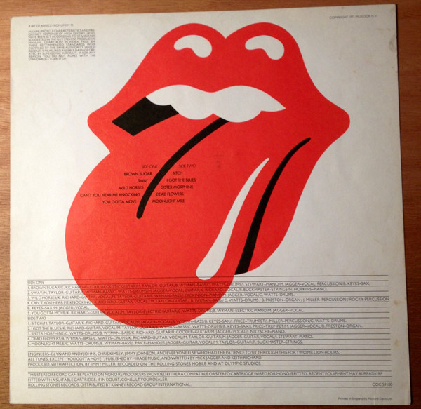
3 - the labels: the tongue in a red version
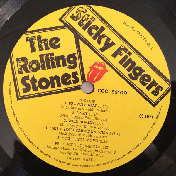
[www.discogs.com]
Edited 5 time(s). Last edit at 2015-07-17 18:45 by Irix.
1 - cover backside: the classic tongue with the double gleam
2 - inner vinyl sleeve: the original tongue by John Pasche
3 - the labels: the tongue in a red version
[www.discogs.com]
Edited 5 time(s). Last edit at 2015-07-17 18:45 by Irix.
Re: First designer of Stones Tongue & Lips logo???
Posted by:
Manofwealthandtaste
()
Date: July 9, 2013 18:25
Anyone wishing to see the original artwork and indeed the letter from the Rolling Stones office asking John Pasche to design a poster and design a logo for the band can find it in the Victoria & Albert Museum here in London.
[www.vam.ac.uk]
[www.vam.ac.uk]
Re: First designer of Stones Tongue & Lips logo???
Posted by:
georgie48
()
Date: July 9, 2013 23:05
A fourth design ..... only a red image printed on a yellow background.
I bought the album in April 1971 in England.
[s1297.photobucket.com]
I bought the album in April 1971 in England.
[s1297.photobucket.com]
Re: First designer of Stones Tongue & Lips logo???
Posted by:
blivet
()
Date: July 10, 2013 00:23
Quote
georgie48
A fourth design ..... only a red image printed on a yellow background.
I bought the album in April 1971 in England.
[s1297.photobucket.com]
Often when designers produce a logo they will create variations for use at different sizes, or when printing in color or black and white/monochrome.
I was wondering if that was the case with the Stones' logo, but there doesn't seem to be any rhyme or reason as to when a given version is used beyond the apparent preference on someone's part for the one we see most often.
It's characteristic of the band that there is confusion and haphazard practice surrounding even its most corporate aspects.
Edited 1 time(s). Last edit at 2013-07-10 00:23 by blivet.
Re: First designer of Stones Tongue & Lips logo???
Posted by:
georgie48
()
Date: July 11, 2013 09:06
Any interview with John Pasche goes accompanied with the Sticky Fingers inlay version of the logo. V&A museum eventually bought that image. Compare the logo on the backside of the SF sleeve with Ernie Cefalu's image and you notice that it has two white stripes on a slimmer tongue and more black is added. Coincidence or inspiration???
Re: First designer of Stones Tongue & Lips logo???
Posted by:
GasLightStreet
()
Date: July 11, 2013 15:34
Ernie Cefalu's logo is ugly. He talks too much. He probably stole the idea and said it was originally his.
Re: First designer of Stones Tongue & Lips logo???
Posted by:
blivet
()
Date: July 11, 2013 20:57
Quote
GasLightStreet
Ernie Cefalu's logo is ugly. He talks too much. He probably stole the idea and said it was originally his.
One thing he said struck a chord with me. He mentioned that the company he did the design for had the rights to use it for about 18 months (something like that -- I'm to lazy to review the video), and they produced a lot of t-shirts, patches and stickers. I remember those products from when I was a kid, with the "ugly" variant of the Stones' logo with each tooth outlined and no reflections on the upper lip. I always sort of assumed it was some kind of knock-off that was just different enough to avoid any legal issues, but if Cefalu is telling the truth, it was actually the original version of the logo before Pasche improved it.
Edited 1 time(s). Last edit at 2013-07-11 22:48 by blivet.
Re: First designer of Stones Tongue & Lips logo???
Posted by:
georgie48
()
Date: July 13, 2013 16:14
I am pretty sure that Pasche's logo with thick tongue was earlier than Cefalu's' but it could very well be that Pasche modified his original design after having seen Cefalu's design.
I also remember buying a Cefalu design logo pin many decades ago, thinking it was a counterfeit, but his interview made me think different.
I also remember buying a Cefalu design logo pin many decades ago, thinking it was a counterfeit, but his interview made me think different.
Sorry, only registered users may post in this forum.
Online Users
Andrea82 , Andrew , Asgard60 , ChrisL , Christiaan , mike567 , NashvilleBlues , stonemac , StonyRoad , TW2019 , wiredallnight
Guests:
1503
Record Number of Users:
206
on June 1, 2022 23:50
Record Number of Guests:
9627
on January 2, 2024 23:10